What's Wrong With This Picture?
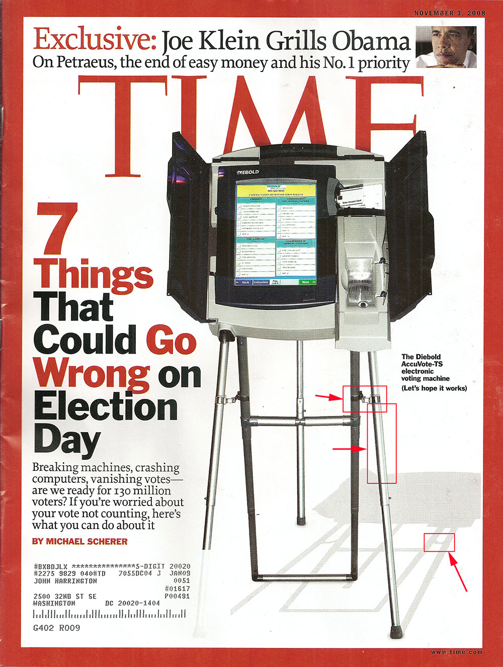 This, the November 3rd issue of Time Magazine, has on its cover a Diebold voting machine, shot on a white seamless. Or, was it?
(Continued after the Jump)
 It looks like it wasn't. Here's the first issue - the two adjusting clips on each leg do not form a cross-bar, yet the "shadow" that was laid down suggests that it is a cross-bar. If the light were coming from the left, as the shadow suggests, there would be nothing that connected the two legs. Each of those clips wrap around the leg.
 Next up is the leg highlight. It is coming more from the center, and ever so-slightly from the right, as shown in the highlight on the leg. That shadow that Time created, clearly skews significantly to the right. Further, the shadow clarity - the edge and so forth, is just much too crisp and clear.
None of this would be a problem if the photo credit inside read "Photo Illustration", yet here's how it reads:
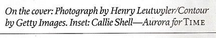
 Clearly, it's listed as a photograph. Once I did a little more research, and I couldn't find it on the Getty site, I stumbled across the exact image in an article here, from 2006.
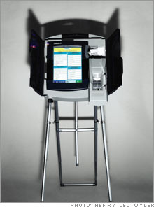
 Here, we see that the shadow is at the top, in a severe fashion, and not likely a cover candidate. Further, the background seamless that photographer Henry Leutwyler used is right up against the back of the machine, not in some spacious studio, as appears in the cover image.
Time Magazine had an issue a few years back with the alterations of shadows, as commented on by the NPPA here:

Now, this shadow adjustment on the Diebold machine here doesn't have the racial implications of the OJ cover, or does it? Are we to believe that Diebold will be the reason that Barack Obama loses? That somehow the Republicans would dictate to Diebold how to throw the election? That that is even actually possible?
I am of the opinion that this image does not meet the ethical test of being a photograph. It is a photo illustration, and should have been identified as such.
Please post your comments by clicking the link below. If you've got questions, please pose them in our Photo Business Forum Flickr Group Discussion Threads.

18 comments:
This is something for the funny and interesting blog Photoshop Disasters
photoshopdisasters.blogspot.com
The clip and highlight position are minor details compared to how the fake shadow lines up with the bottom of the feet. The shadow from the middle and back leg are nowhere near where they should be.
How can you mock shoddy Photoshopping when your post begins "has on it's cover". Let he who is without sin....
Uhm, what mtreinik said. You're obsessing over highlight detail when the entire shadow is out of whack. Look at where that back leg shadow starts.
You're right either way, but this is almost a "missing the forest for the trees" type of thing.
http://mac.softpedia.com/get/Word-Processing/Grammatica-Spelling-and-Grammar-Checker.shtml
http://www.ultralingua.com/en/mac-grammar.htm
http://www.whitesmoke.com/
http://www.innerexception.com/2008/10/tip-using-built-in-os-x-grammar-checker.html
TIME to pony up John. You are a professional: write like one.
Does anyone here really care about Time magazine?
I get my news from NEWSPAPERS or the WEB.
Time magazine is a thing of the past; and it hasn't been an important vehicle for news for years. As a matter of fact I canceled my subscription years ago when the management started treating their photographers like crap.
News happens every instant; I'm not going to wait for a week to see it from Time. I also don't care that they use Photoshop to fix their imagery; it only goes to show how "bottom of the barrel" our friends at Time have become.
For those of you who have decided that my grammar is more important than the message, feel free to stop reading the blog, since you're so mired in the weeds that you can't see the forest for the trees. I am happy to have people e-mail me with grammatical corrections, or thoughtful suggestions on the blog, but when you take a holier than thou stance, then maybe you're just better off getting these insights elsewhere....wait, oh right, no one else does do this - at least not with the frequency or transparency that I do. So, I say again, feel free to stop reading anytime, or take a more constructive tact in your guidance.
-- John
John,
Forget about the fact that this is your blog, done on your time, using your content on your server and offered for free to the pro photography community for their use and interpretation as they see fit for no cost or obligation to them.
I suggest you drop everything immediately, cancel any upcoming work, call your clients and let them know you will be unavailable until further notice, and enroll yourself in a remedial writing course, post haste. You owe it to the readers of your FREE blog to git yer grammar correct! Don't worry about the important news related to the industry we all follow and earn our living from, just make sure your writin' is good.
Thanks for offering your opinions on the industry John, I don't always agree with you but, I couldn't care less about your spelling and grammar, it's the messages and opinions I come here for, not a writing lesson.
What caught my eye was the missing shadow of the back leg. It fails to exist in shadow at all! They should have eliminated the shadows (clutter) in the editing.
I have known you for a long time, I for one have learned a lot from you. Thank you for taking the time to write this blog. I know my writing can be awful at times, thank god for spell check! That is why I am a photographer and not a writer! Good seeing you in NYC! Sorry we didn't get a chance to talk more. Keep up the good work.
Please, grammar nit-pickers, leave the holier-than-thou snarkiness to John. That's his territory, and you have no right to it.
Umm, the shadow of an object that touches the ground starts where it touches the ground. Full Stop.
This isn't even vaguely close.
Fiddly bits like the highlight and the crossbar are deck chairs on the Titanic.
I think we are missing the big picture. Newsweek chose to use an existing image and photoshop it (badly I might add) rather than hiring a photographer to produce something useful.
Time, Newsweek, and US News and World report wondered why their circulation is falling. (Hint: it has very little to do with FOX News Channel). The further their quality and content falls, the more their readers trickle away.
Even I know why they are dying. (Another hint: begins with "cheap").
Back in early 2007, Time Magazine began plummeting downhill with regards to design and useful content when they had a regime change and got rid of a lot of great talent and replaced them with writers and designers who had name recognition but lacked the ability to hold onto subscribers. I regularly laugh when I see the Time Magazine covers on the news stands because they're horrible.
John, your point is valid and Time needs a new regime change that understands the ethics of journalism and the skill of design.
John, how about just double-checking every time you write "it's"? The rule's not so difficult, just the opposite of the usual one, and your thoughts would soon come over more professionally and not be so undermined.
In the latest post there's a "for it's CEO, Charles Mauzy, and a comparable amount to it's President, Maris Berens". They're breeding like sensor dust spots! You wouldn't think of supplying pics with dust spots, would you?
The irony here is flawless. John nit picking Time about persnickety details that 99% of the readers could care less about while defending his right to use poor grammar because people shouldn't care about it on HIS blog.
English has such a backwards, illogical grammar. My favorite illustration is "its" and "it's": the possessive "its" is dis-possessed of an apostrophe, while the contraction "it's" is expanded with an apostrophe. Possessive dispossessed? Contraction expanded? Sheesh, no wonder people hate grammar.
I will probably be in the minority here, but i really feel like this is a pretty trivial issue, whether this was labeled a photo or photo illustration. It seems pretty clear that the machine was removed from some sort of photograph and incorporated into the cover art. I think it would have been perhaps nice, and technically more precise for it to be labeled photo illustration, but it isn't misleading as is. It is most important that the distinction be made when the reader is likely to be confused about whether the image is real or altered significantly by software. For the record, if I were to run this in the paper I work for, I would have labeled it a photo illustration.
Post a Comment